Dashboard (🏠)
Your whole financial picture at a glance — the first screen after signing in.
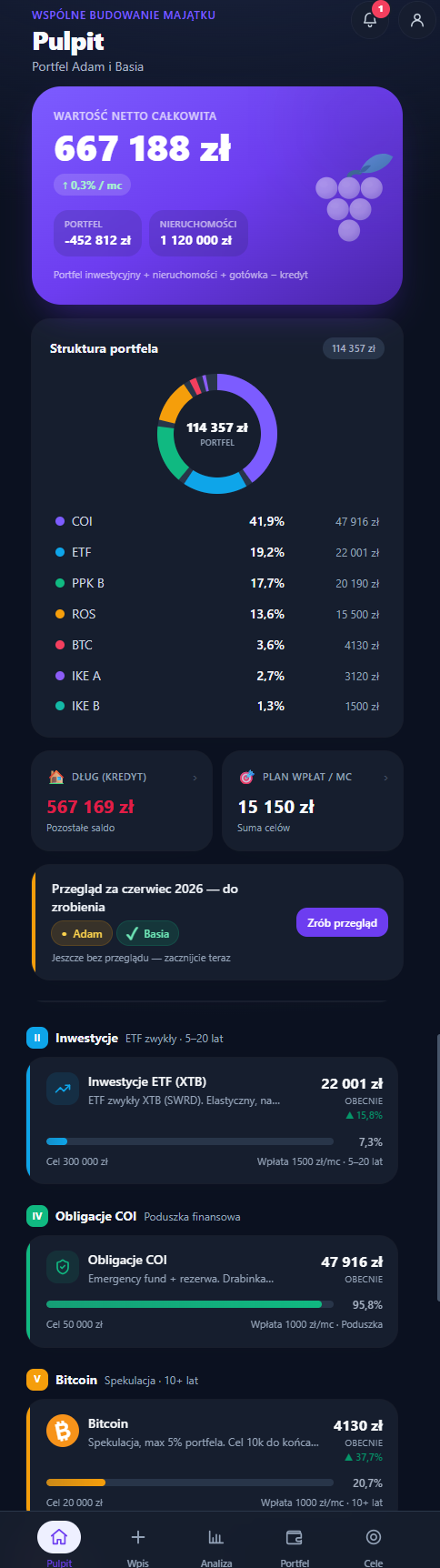
The dashboard is for looking: one hero, a preview, and a way into the details through sheets — no editing. You change values and accounts in the Portfolio, and you record contributions in the Entry. That way there are never two places for the same thing.
A fresh account (no holdings or assets yet) shows one clear step under the hero — an "Add your first account" button that leads to the Portfolio. Nothing else competes for attention: no 0 zł indicators, empty donut, plan, tabs or "waiting for your entry" banner — they appear once there's something to show.
Opening animation
On the app's first launch, on the first start after installing it to the home screen, after every sign-in and after unlocking your plan with your password (or recovery code), a short animation (about 3 s) comes before the Dashboard: six grapes appear one by one on the tile, the stem draws, the leaf unfurls and the "GrapeVest" name fades in and stays for a moment. Then the mark flies off — on a computer straight into the logo in the side menu — and reveals the Dashboard.
- If you're already signed in and simply open the app, there is no animation.
- A tap, click or any key skips it immediately.
- With "Reduce motion" turned on in your system, the mark appears briefly and fades out instead.
- It works the same in local mode and with a cloud account; the demo skips it. It only remembers that the animation has played (on this device) — no plan data.
Hero — net worth
At the top, your total net worth:
assets − liabilities (i.e. portfolio + cash + real estate − loans)
Below the amount (on a phone) a short breakdown: Portfolio (investments and cash — liquid wealth), Real estate (homes, land; only if you have any) and Liabilities (debt, if any). Cash counts toward the portfolio, not real estate. It's a description, not buttons — so there are no pill backgrounds that looked tappable; labels are full and in sentence case (capitals used to clip "Real estate" in Polish).
The main amount scales to the screen width, and the breakdown values are shown abbreviated (e.g. "1.16M zł", "569k zł") so nothing gets clipped on narrow phones. On a computer the people switcher has two rows: adults first and children in a separate row below them, with a quiet "Set aside for:" label — a child's chip is a view of the money set aside for their goal, not a fourth "share" of the wealth next to "Together" and the adults. On a phone, when there are more than three chips (e.g. Together, Kuba, Ania, Zosia), they all sit in one row, with a thin divider before the children — two rows plus a label used to take half the card before the amount even appeared. Screen readers still hear "Set aside for:".
Below the card (Together scope, on phones and desktop) there's one line with three answers: "Cushion 6.7 mo. · 4,000 zł short of plan · Debt-free ~2051". These are the same numbers as the "Are we safe?" card in Analysis, the plan KPI and the goal card — a 30-second glance without scrolling. The line links to Health in Analysis, where the full sentences are. A missing part (e.g. no debt) is left out; when the line doesn't fit a narrow screen, it ends with an ellipsis.
People switcher
When there's at least one child in the family or a holding has an assigned owner, a row of pills appears above the amount: Together (the whole household — the same word as "closed together" in the ritual; it used to say "Family"), each adult (the managing accounts) and each child. The choice filters the whole dashboard — hero, KPIs, structure and categories — not just the amount. It's the same filter as "Whose:" in Portfolio: the selected person carries over between the two screens for the rest of the session. An option the other screen doesn't have ("Joint" exists only in Portfolio, children only on the Dashboard) leaves it on "Together".
An adult's view shows their own wealth + the joint: everything you bought together that isn't assigned to anyone (home, land, cash, a shared loan). By default the joint part counts in full toward every adult ("we're a team"). In Settings you can switch this to a 50/50 split — then joint holdings count half toward each person, and your wealth together with your partner's adds up exactly to the whole household (useful under community of property). This is only a way of presenting the data — it changes neither the data nor the Together total. A child's view shows what you're setting aside for their goal (holdings and assets with that child as the beneficiary) — children make up the family, so they show up on the hero even when nothing has been set aside for them yet (amount = 0). It's a view only — it doesn't change plan data and isn't persisted. Until there's a child or an assignment, the switcher doesn't appear.
Outside the Together scope the hero says plainly whose wealth you're looking at — instead of "Total net worth" it shows e.g. "View: Kuba · own + half of shared" (with the 50/50 split), "View: Kuba · own + shared" or "View: Zosia · set aside for the child's goal". The "View: name" form needs no grammatical inflection of names (which matters in Polish).
In a person's or a child's scope, everything that is computed for the whole household is either hidden or labelled as such:
- the "Are we safe?" card, the health score and the income-and-expenses chart disappear (they cover the whole family, so in one person's view they would mislead),
- the contribution plan stays, but as "Household plan / mo"; in a child's view there's no KPI row at all (0 zł liabilities and the household plan say nothing about the child),
- the ritual suggestion ("Consider…") and the plan check disappear — they're about the household; only "closed together" stays,
- the "Equity" line next to a loan (home − mortgage) uses the same shares as the rest of the view: with the 50/50 split it is half the home's value minus half the loan, not the full home value minus half the loan.
What changed — the change and one sentence
The hero amount is net worth as of today (with live prices), so the label reads "Net worth · today". The month of the latest entry is carried by the change pill. Below the amount there are two things:
- A change pill, e.g. "▼ 8,130 zł in September". The dash at its start matches the brighter segment of the chart next to it — that's the part of the line it describes.
- One sentence in regular text, e.g. "You added 2,301 zł, but valuations and FX fell by 10,431 zł." "Added" means contributions plus principal repaid (minus withdrawals); in a solo plan and in one person's view it reads "2,301 zł added", and when withdrawals outweighed it — "You took out …". When valuations didn't move, the sentence ends with the contributions.
The full breakdown is under "Where this came from ›" (the same names as in the Analysis), and the parts always add up to the change in net worth:
- Contributions — what you put into accounts and investments,
- Withdrawals — money taken out of accounts (e.g. an ETF sale), shown separately,
- Principal repaid — how much the debt balances went down (principal from instalments + overpayments); an overpayment is counted here, not under contributions, so it isn't counted twice. When debt grew, the row is called "Debt increase",
- Valuations and FX — the rest: prices, exchange rates, bond interest, new property valuations and manual balance corrections. This part used to be called "market & valuations", which read like "we lost money on the market", although it's just the rest.
Below the breakdown there's one sentence of explanation, and when there are position snapshots and one position explains most of the valuations — that position too, e.g. "Biggest mover: Flat −8,000 zł."
Months filled in later. When the previous months only have an estimated snapshot (see Calculations), the change is counted from the last real snapshot: the pill says e.g. "▲ 7,778 zł since June 2026", and a short note — "July and August are estimates, so we compare with June 2026." This way the estimate's error doesn't land in "valuations and FX" pretending to be a loss. The pill and the chart caption then show the same amount. When the entry month itself is an estimate, the hero doesn't split the change and only mentions contributions. Without a snapshot from the previous month only the contributions sentence is left; with no data — nothing.
In a person's or child's view the numbers use the same shares as the rest of the view: with the 50/50 split a joint item gives the person half the contribution and half the repayment, so Kuba's and Ania's breakdowns add up to "Together" (e.g. 4,800 zł + 3,150 zł = 7,950 zł of contributions) — to the złoty, in every part. The family's parts are rounded once, and the odd złoty of a joint amount goes alternately to one person and the other: a joint 679 zł repayment is +340 zł for Kuba and +339 zł for Ania. A person's view label ("View: Kuba · …") doesn't name the month, so the "as of …" line stays below it.
The people switcher is one row: Together, the adults, then "Set aside for:" and the children. When there's no room (a phone, long names), the "Set aside for:" group with the children moves to a new line as a whole — the child is always visible, with no sideways scrolling.
In the Together scope there's also a trend line of net worth over the past year, labelled with a number: "Past year: +48,300 zł" when there's a snapshot from exactly 12 months ago, and with a shorter history — where it starts, e.g. "Since November 2025: +41,200 zł". The earlier "11 mo: …" caption looked like a mistake.
The value axis uses round amounts (a 1–2–5 step, e.g. every 5k zł). Month labels adapt to the length of the history: every month for a few months, quarterly for a year, half-yearly for two years (with the year on the first label and on January). Dots mark each point for up to a year of history; an estimated month (filled in later) has a hollow dot and "estimate" in the tooltip. Segments touching such a month are dashed, and a legend "estimate: months filled in later" appears below the chart. The segment described by the change pill is brighter. When the history is longer than six months, a 6 mo · Year · All range sits above the chart (up to a year of history only "6 mo" and "All"); the choice is remembered on this device.
The dashboard is dense: a summary on top, details in sheets on tap — the key information fits without much scrolling.
Are we safe?
Each screen has one job: the Dashboard is the pulse plus one decision (the monthly ritual), Analysis explains causes and trends, Goals says how much is missing. So the card with three safety facts lives in Analysis (Health); the Dashboard keeps only the pulse line below the net-worth card. The card works in both view modes (Simple and Full):
- Cushion — how many months of expenses the cash and positions marked as the cushion cover (e.g. "Your cushion covers 13.5 months of expenses"), with short context: under 3 months "worth building up", 3–6 "within the typical range", above — "a comfortable buffer". Without an entry with income it shows the amount. Below it is where the number comes from, including the averaging window, e.g. "57,953 zł (COI bonds) ÷ 4,283 zł expenses/mo (average of 6 mo.)" — the cash-flow chart further down uses 12 months and says so too, so two different expense averages don't look like a contradiction.
- You put aside — the average savings rate over up to the last 6 months.
- Debt — the share of your assets financed by loans (e.g. "typical with a mortgage").
The card doesn't rate with colours or points. The "Financial health" module doesn't replace it: the 0–100 score appears next to it, in the KPI row, as extra detail. The simplest answer ("how long the cushion lasts") stays on top no matter how many modules are on. The card covers the whole household, so it's shown only in the Together scope.
KPIs
On a phone, a compact Monthly plan chip (opens the breakdown of planned contributions) and, with the "Financial health" module, a Health chip (a 0–100 score — tapping takes you to the Analysis). The labels are short so nothing gets clipped in two columns. From the "lg" width the whole section disappears — the KPIs then live in the row below the hero.
The plan answers "are we on track?" — and it's the only place with the plan and actual numbers. The value is the answer itself: recorded / plan, e.g. "11,754 / 15,754 zł", and the caption states the difference in words: "October: contributions + instalments 4,000 zł below plan (overpayment)". When a single item explains the whole gap, the caption names it (debt → "overpayment", investment → its name in quotes). When the ritual banner already names the gap (the amount and a "Pay 4,000 zł now" button), the caption is shorter — "October: contributions + instalments below plan" — so the same amount doesn't appear three times on the screen. When the entry covers the plan — "October: contributions + instalments on plan". Without an entry the tile shows just the plan amount, captioned "contributions + instalments". In The tile opens the plan sheet with two columns: Plan and the month of the latest entry (e.g. October) — for every item, what you plan and what you recorded (contribution, overpayment or instalment). The row that explains the gap is highlighted and labelled, e.g. "4,000 zł short" (not by colour alone), and the column totals are the same two numbers as the tile. Below that label there's a "Change plan" button — it opens the same plan editor as the ritual banner under the table (with the live preview for a debt). Without an entry the sheet shows the plan alone. In the hero, "contributions" means only money put into accounts; here it's contributions and instalments, so we always write "contributions + instalments". The plan is the sum of planned contributions, fixed loan instalments and planned overpayments; "paid in" counts the contributions, instalments and overpayments recorded in the entry. We allow a 1% margin (instalment rounding). The comparison uses the current plan — plan history isn't stored.
Below the health score there's a word and — if there is one — a factor to improve, e.g. "okay · to improve: diversification" (the factor is lower-case because it sits mid-sentence; in German the noun keeps its capital; thresholds: 75+ in good shape, 50+ okay, lower — needs strengthening), so the number never stands alone; the text wraps instead of being cut off. The factor must agree with the "Are we safe?" card: strong areas are never named, and debt only when the card also calls it high — a typical mortgage isn't "to improve". Debt has no separate card — the Liabilities pill in the hero shows it. Liabilities aren't red: in the app red only means a drop in value, and debt is a state.
Tabs
On a phone the rest of the dashboard lives in two tabs: Breakdown and Goal (in a person's or child's view there's only the breakdown, so the tab bar disappears). There used to be a third one, "Categories" — it showed the same categories and percentages as the donut legend, just with a different interaction. The phone now has the same panel as the desktop.
-
Portfolio structure — a donut with a legend at the category level (e.g. Retirement, Investments, Bonds, Cash), with the share and amount next to each; it also includes cash (since cash counts toward the portfolio). Every segment uses its category's colour (the same as in Settings), and cash is a neutral grey. The colour doesn't depend on the order: cash doesn't get the loan's colour, and switching people doesn't swap colours between categories. Shares always have one decimal place ("12.0%", "38.5%"), so the percentage column has a single precision. The legend rows are buttons: a category opens a sheet with its holdings (a single holding opens its details straight away), and Cash opens the list of cash accounts. The donut itself is an illustration: its segments aren't keyboard stops (selection happens in the legend), and clicking a segment with a mouse does the same as its row. Below the legend are the debts — the debt category row with the full amount (e.g. "−559,200 zł") and two short lines: "Equity: 290,800 zł" and where it comes from ("Home 600,000 zł − loan 309,200 zł"); the full sentence is in the hover tooltip. The category sheet shows:
- for a loan: interest rate, instalment, principal/interest split, estimated payoff,
- for bonds: maturity date,
- for accounts with a limit (IKE/IKZE): remaining annual contribution room.
When the scope has a single category (e.g. a child's view), the centre of the donut shows the amount and the category name — it used to say "100% BONDS", a percentage with no content. The button in the card header then says "Details". The total button opens the "Portfolio" sheet: investment holdings and cash, largest first, with the same total as the button and the centre of the donut.
-
Goal — a teaser of your top-level goal: name + progress (e.g. "debt-free", FIRE; only in the Together scope), with a "Manage in Goals" link. Below the bar the card states the pace and horizon:
- debt-free — how much the debt balance drops per month and the year the debt will be gone, e.g. "debt shrinks by an average of 658 zł/mo · at current repayments debt-free around 2051". "Average", because it's the drop in balances from snapshots of the last up to 12 months — the hero next to it gives the principal repaid this month ("+679 zł"), and without the word the two numbers looked contradictory. Without snapshot history the card gives this month's principal part of the instalment and overpayments (no "average"). The year comes from one debt schedule — the same one Goals, Analysis (the payoff takeaway and the balance in FIRE) and the loan details use: balance, interest rate, instalment and the average overpayment over the last 12 entries (without entries — the planned overpayment, "per plan"). When the year from the instalment falls later than the end of the contract, the card doesn't cap anything; it states both dates: "the contract ends in 2049; at the entered instalment it takes until 2053 — check the instalment". The progress percentage is written the same way as in Goals (whole percent, rounded down). Details: Calculations,
- amount goal / financial independence — the average contributions over the latest (up to 12) entries and the year you'd reach the goal from contributions alone, without market gains. Full goal editing lives in one place — on the Goals screen — so the UI isn't duplicated.
- goals gap — when the dated goals don't fit into what you set aside, or a goal
is past due, the card has one line linking to Goals, e.g. "Goals: behind
pace on “Budowa domu” (until June 2027) · past due: “Wakacje” ›". The shortfall
amount isn't shown on the Dashboard — only in Goals, so the same number
doesn't repeat on three screens. The driving goal and date come from the same
calculation as the Goals verdict. When everything fits, there's no
line. On a phone the line is in the Goal tab.
Alongside it, "For
{name}" tiles (in Polish: "Dla dziecka:{imię}", a form that doesn't inflect the name): wealth set aside for a given child's goal (beneficiary), regardless of who owns it. The tile is tappable — it shows details (a single holding directly, several as a list).
On desktop (≥ lg) — Wealth Command Center
On a wide screen the dashboard isn't a "stretched phone": the tabs disappear and all the sections arrange into one coherent view. The phone view stays unchanged — this whole layout is a layer added from the "lg" width upward.
- Greeting — instead of the "Dashboard" title, a time-of-day greeting addressed to the couple: "Good evening, Kuba & Ania".
- Full-width hero — net worth (the largest number in the app), the "what changed" sentence, "as of …" and the 12-month trend.
- KPI row below the hero — Assets · Liabilities · Health · Plan/mo in calm cards. The desktop hero has no pills under the amount, so the "Assets" caption splits the total: "portfolio 431k zł · property 850k zł" — property is visible without opening the Portfolio. "Health" leads to the Analysis, "Plan/mo" opens the contribution breakdown. Every tile that opens something has a "›" arrow next to its label — a hover effect alone didn't say it was clickable.
- Portfolio structure — one card, the same as on the phone (see Tabs): a donut and a legend at the category level, with amounts and shares always visible; small items collapsed into "Other". The legend rows (including "Cash") are buttons; the donut segments aren't keyboard stops — they used to be buttons with no visible focus, and Enter only highlighted the segment. Below the legend are the debts, with equity in two short 12 px lines instead of one 11 px sentence wrapping onto four lines in a narrow column.
- Goal and children — the second column next to the structure answers a different question: "where are we heading?". The goal card with pace and horizon, and the children's tiles below it — stacked, so none of them stretches to the height of the neighbouring card.
- A person's contributions (person or child view) — the goal is the family plan, so in
its place there's a "Contributions:
{name}" card: what this person put in with the latest entry, item by item (joint ones marked "½ of joint"), with the total and their share of the principal repaid. Contributions toward a child's goal (e.g. 800+ bonds held in a parent's name) aren't mixed in with the person's own — they sit lower, under a "Set aside for: Zosia" label. "Total" covers everything, so these are the same numbers as the hero sentence. The structure no longer stretches across the whole screen. - Income & living costs ("Cash flow" module, Together scope only) — below the structure and goal: first "where are we" and "where are we heading", cash flow is context. Above the bars, a sentence that bridges spending to the cushion: "Average over the last 12 mo.: income 15,955 zł; spending: living costs 4,783 zł + instalments 3,804 zł = 8,587 zł; you put aside (contributions and overpayments) 7,368 zł/mo". The "= 8,587 zł" total is the same number and the same window (up to the last 12 months with income) the "Are we safe?" card uses for the cushion — without this bridge, "living costs" on the chart and "expenses with instalments" in the cushion looked like two different amounts. "Living costs" is income minus contributions, overpayments and instalments (expenses aren't measured). Without loans the sentence doesn't mention instalments. The chart series is called "Living costs" (it used to be "Living costs & other"). The sentence has a capped width (about 65 characters) so it doesn't run across the whole screen. The amounts on the right above the chart are the current month and say so ("October: 15,955 zł · 4,201 zł"), so they aren't confused with the averages in the sentence. The axis writes amounts the way the rest of the app does ("30 tys." in Polish, "30k" in English). The chart stays on the dashboard because the Analysis doesn't have it.
- Insights Rail (from very wide screens) — a right column with "Topics to review" (max 3). It appears only when there's something to say: with no topics there's no column. It doesn't repeat the growth sentence from the hero or the ritual status, which has its own banner on the dashboard (below).
- The profile chip in the side menu (at the bottom) shows the person at this device — "Ania" on Ania's computer, not always the main person. It's the same rule as "You" in Settings: in the cloud the role chosen on the device counts, and locally (with no choice made) — the main person. When it's unknown who is at the device, the chip shows the plan name or "Kuba & Ania" — we don't guess a person.
- At the end of the page — the couple and the rhythm of the plan: avatars and names ("Kuba & Ania"), the number of entries and the latest one, and the next entry (e.g. "next entry: November 2026"). The page no longer ends on the debt bar.
Operations during the month
When you have accounts with instruments,
there's an "<Month> · in progress" card under the hero: this month's latest
operations (date, description, amount) and an "Operations: N · open the entry"
link. The "Operation" button (on a phone also floating above the bottom
navigation — within thumb reach) opens the operation sheet: record a purchase
right away, and at month end the entry already has it. After saving, a message
"Saved: Buy CSPX. It goes into the October 2026 entry." with Undo. Operations
during the month don't change the ritual banner — the month still "waits for the
entry" until someone does it.
Monthly ritual
The dashboard depends on whether the current month is closed:
- Before the entry — a "
{Month}is waiting for your entry" banner with a Make the entry button. If one person has already saved, the banner says who it's waiting for: "{Month}is still waiting for Kuba". When the entry has amounts but nobody is recorded as having saved it (an older save from a device with no person picked), the banner doesn't pretend there's no entry: "{Month}saved — to be confirmed" with an Open entry button. The banner, the status bar and the couple status in the entry share one month-status rule — see Monthly entry. - Once both have closed it — "
{Month}closed together · Kuba & Ania" (a section heading, so screen readers find it in the headings list; the names of the people who saved the entry; the entry doesn't store when) and one "Consider…" suggestion, only from reliable rules: first an overdue entry or a bond maturing within 90 days, then a gap against this month's plan, then a position at least 5 pp below its allocation target (the same model as "Split a contribution" in the Portfolio). - A gap against the plan is a choice, not a reprimand. The banner says what's missing
and where ("Consider: 4,000 zł short of the plan on “Mortgage”") — without repeating
"X of the planned Y", since those numbers are in the plan KPI — and offers two ways out:
- "Add the overpayment to October" (for an investment: "Add the contribution to…"; it used to say "Overpay 4,000 zł now", which read like a payment — GrapeVest doesn't pay anything, it records what you did) — opens the Entry on this month,
- "Change overpayment plan" ("Change contribution plan") — expands a field with this item's planned monthly amount; saving changes the plan right away (0 removes the item from the plan). For a debt, the field shows the consequence live, from the same schedule as the "Debt-free" goal: "at 4,000 zł: debt-free around 2034", and after typing 0 — "at 0 zł: debt-free around 2051". Nobody saves a zero without seeing what it changes. The same editor opens from the "Change plan" button in the plan sheet (next to the highlighted gap row).
- The same gap for 3 months or more usually means the plan doesn't fit real life. The banner then says so as an observation about the plan, not another counter: "No 4,000 zł overpayment on “Mortgage” in your entries for 2 years — maybe the plan doesn't need it?" (for an investment: "…maybe the plan is set too high?"). The time is given in months, and from a year on — in years ("for a year", "for over 2 years"), so the number doesn't sit next to the streak of closed months ("24th month in a row") — success and a gap don't speak with the same number. Changing the plan then comes first, with the overpayment as the second option. We count consecutive entries with a gap on the same item, compared with the current plan.
- An overpayment that feeds the main goal. When the main goal is "Debt-free" and the
missing piece is exactly the loan overpayment, asking "maybe the plan doesn't need it?"
would work against that goal. The banner then states the consequence instead of
deciding for you: "Overpaying 4,000 zł/mo brings the end of the loan forward from 2051 to
around 2034 — there hasn't been one for 2 years. Keep it or change it?". The years come
from the debt schedule (
debtFreeHorizon— the same year as in Goals and on the goal card): 2051 at the current repayment pace, 2034 with the planned overpayment. "Add the overpayment" is then the main action and "Change plan" the second one — with the live preview in the field. Your partner will see the plan change (plan changes are logged in notifications). - The sentence "This month's contributions + instalments match the plan." appears only when the plan was actually checked and the payments cover it. Without a contribution plan the banner says there's nothing to compare against — we don't pretend "everything is going to plan".
The month is the current calendar month — when a new one begins, the banner goes back to the invitation.
- A gap that lasts a year or more is no longer "a month without an overpayment" but a plan you don't follow in practice. The banner then asks about the plan: "The plan assumes 4,000 zł of overpayment — in practice you don't make it. Pay off the loan 17 years sooner, or change the plan?" (2051 → 2034 from the same schedule). The streak ("Full bunch — month 24 in a row") moves from the banner to the Dashboard footer, so success and a long gap don't share one card.
- Plan editor: the field is as wide as an amount, with Save plan and
Cancel next to it (Esc does the same and returns focus to "Change plan").
In a couple's plan a note says the other person will see the change. After
saving, an Undo toast appears, e.g. "Overpayment plan: 4,000 → 0 zł". A
holding whose plan you changed during this visit stays in the plan sheet with
"Change plan", even at 0 zł. When what you recorded equals the plan, the plan
tile shows "11,754 zł ✓" instead of "11,754 / 11,754 zł". The plan tile has a
stable address,
/#pulpit-plan— the monthly-plan notification opens it and moves keyboard focus there. - Formatting: every amount on the Dashboard groups thousands, also four-digit ones ("4 000 zł", "2 753 €").
- Child view: the card is titled "Set aside for:
{name}", and a single category is shown as one row with the amount instead of a 100% ring. - Bell on the desktop Dashboard sits in the header next to the theme toggle and "Add entry", not in its own row above the greeting.
Status bar (desktop)
On the other screens (the dashboard doesn't have it) the top bar shows net worth and what it actually checks: the current month's status — "October: entry ✓" (closed), "October: Ania ✓ · waiting for Kuba", "October: saved, to be confirmed" or "October is waiting for your entry". It's the same rule as the ritual banner and the couple status in the entry — before, the bar said "entry ✓" whenever the entry had any amounts, while the banner next to it said "waiting for your entry". Earlier still it said "on track ✓" without comparing the plan; plan vs actual lives in the plan KPI on the dashboard.
Overdue month
If there's a gap in the history — a month without an entry between the first entry and
the current one — an amber bar appears below the tiles: "⏳ Overdue entry: {month}"
(or "Overdue entries: N — start with {month}"). Tapping opens the Entry
straight on that month (a ?month=YYYY-MM link), so a skipped month doesn't quietly
disappear. A new user with no history doesn't see the bar (there's nothing overdue).
Moments that matter
GrapeVest reacts to real milestones — calmly and once, without gamification:
- Streak of closed months. After closing a month, the ritual banner shows a bunch of grapes: each month closed together is one grape, a full bunch is six months in a row. New grapes "ripen" one by one, with the streak shown below.
- A milestone card above the ritual appears when, since your last visit on this device, net worth passed a round threshold (e.g. 500,000 zł), you reached a goal, or financial health moved up a level. One sentence, one next step and a close button; the same moment doesn't come back.
- Net worth counts up from the amount on your previous visit to the current one.
The first visit celebrates nothing (the app only remembers the state), and neither does demo mode. With the system "Reduce motion" setting you get a short fade instead. What you've seen is stored by the browser on this device — not in the plan or on the server.
The settings button (the cog in the top-right corner on a phone) sits in the screen header and scrolls with it — it no longer floats over the cards while you scroll. Bottom navigation labels are 12 px.
People avatars are initials on a tone that stays the same for each person (on the Dashboard, in the menu and in settings); an emoji shows when someone picked one.